The Pixelated Masterpiece: How Burnley’s 2022/23 Home Shirt Redefined Modern Retro
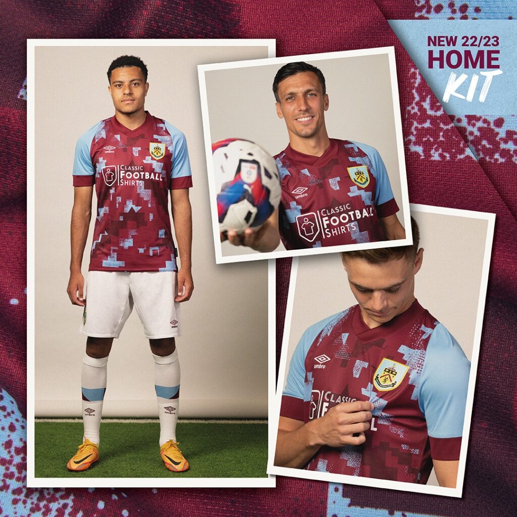
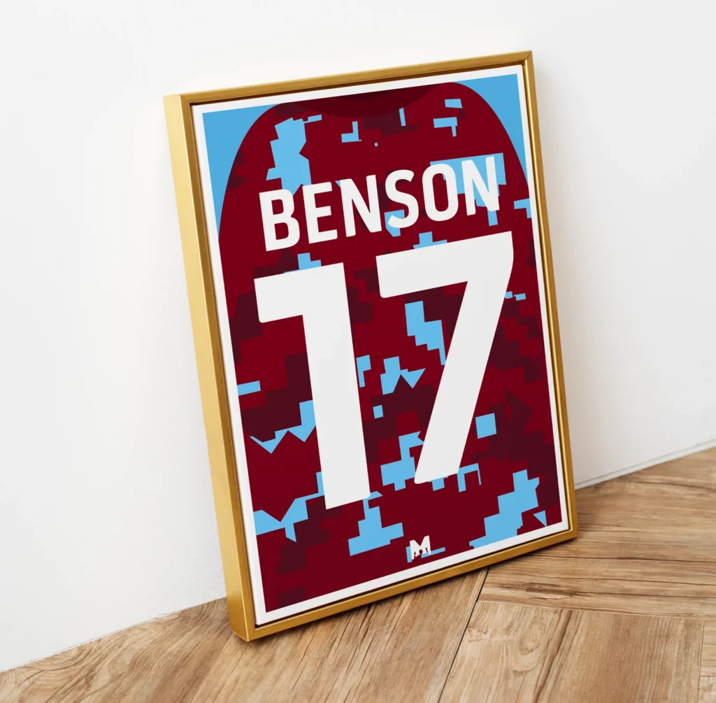
The Burnley 2022/23 home shirt is more than just a piece of polyester; it is a case study in how to respect history without being held hostage by it. When Umbro unveiled the kit, it immediately sparked a conversation that went far beyond the Turf Moor faithful. It was a digital love letter to the Burnley 1991/92 title-winning season. Still, instead of a carbon copy, it offered a “glitch in the matrix” that resonated with a new generation of fans and fashionistas.
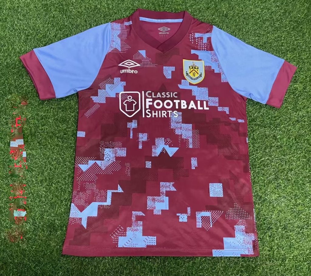
In an era where “retro” often feels like a lazy shortcut for designers, Burnley and Umbro took a risk. They leaned into the “Pixelated Graphic” aesthetic, proving that the DNA of the 90s can be restructured for the high-definition demands of the 2020s.
Why did Umbro choose a pixelated design for the 22/23 season?
To understand the Burnley 2022/23 home shirt, you have to look back thirty years. The Burnley 1991/92 season was iconic for Burnley—a Fourth Division title win that signaled the start of a climb back up the English football pyramid. The kit from that era was a chaotic, zig-zagging mess of Claret and Blue, quintessentially “90s.”
Bridging the 30-Year Gap
Umbro’s challenge was to honor that specific 1991 design without making the players look like they were wearing a thrift-store costume. The solution was “Digital Reconstruction.” By taking the sharp, aggressive lines of the original 91/92 pattern and breaking them down into pixels, they created a visual bridge.
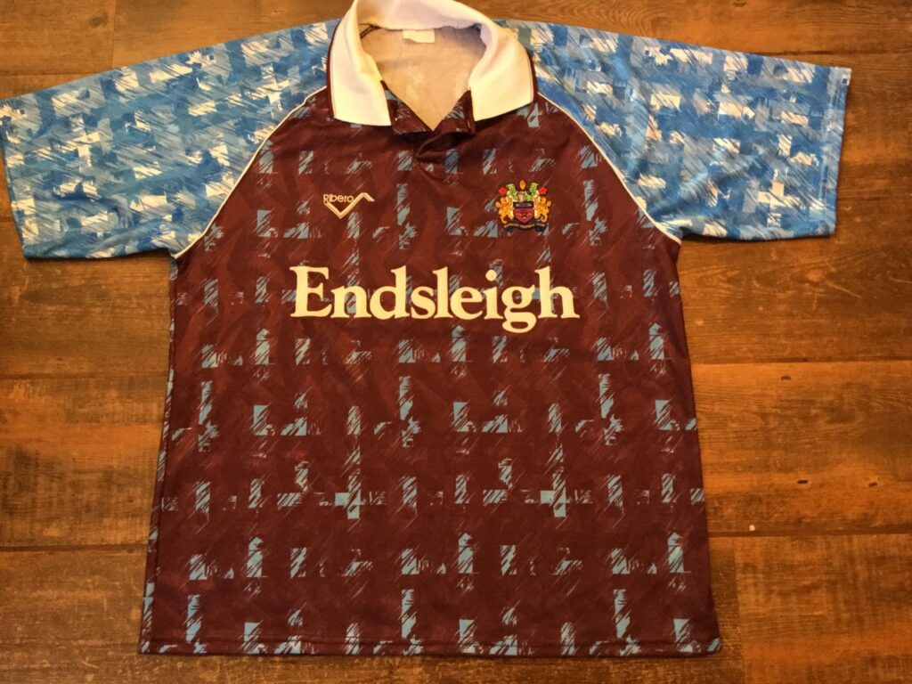
- The Original: Sharp, high-contrast geometric shapes.
- The 22/23 Version: A staggered, pixelated print that fades and merges.
- The Result: A shirt that looks classic from a distance but reveals a modern, intricate texture upon closer inspection.
The “Glitch” Aesthetic
The 2020s have seen a massive resurgence in lo-fi and “glitch” art in digital media. By applying this to a football shirt, Umbro tapped into a visual language that felt familiar to Gen Z and Millennials who grew up with Minecraft, retro gaming, and digital distortion. It wasn’t just a tribute to 1991; it was a 1991 design viewed through a 21st-century lens.
Is the “Blokecore” trend the real reason for this shirt’s success?
Timing is everything in fashion. The 2022/23 season coincided with the explosion of “Blokecore”—a trend where football shirts are paired with straight-leg jeans and vintage sneakers for a casual, street-ready look.
Why does this shirt fit the street style?
The Burnley 22/23 home shirt avoids the biggest pitfall of modern football kits: looking too much like “performance gear.” Because of the pixelated pattern, it feels more like a patterned polo or a streetwear knit than a sweaty gym top.
- Color Balance: The deeper Claret tone provides a sophisticated base.
- Texture: The “all-over print” hides the fabric’s technical mesh, making it look more like high-fashion apparel.
- Vibe: It carries an “anti-fashion” coolness. Burnley isn’t a global giant like Real Madrid or PSG, which gives the shirt a “niche” and “authentic” appeal that streetwear enthusiasts crave.
The Death of the “Gaudy” 90s
In the 90s, kits were often criticized for being “too busy” or “ugly-cool.” By pixelating the design, Umbro softened the harsh edges of the 91/92 inspiration. This makes it infinitely more wearable for a casual Saturday afternoon at a pub or a music festival. It doesn’t scream for attention; it earns it through subtle complexity.
How does digital reconstruction solve the “dated” feel of ’90s graphics?
We have all seen “throwback” kits that feel uninspired—they look like photocopies of photocopies. The Burnley 22/23 kit avoids this by treating the ’90s DNA as a raw material rather than a finished product.
Solving the “Turf Moor” Identity Crisis
Burnley is a club built on tradition, but under the leadership of Vincent Kompany (who arrived that same season), it sought to project a modern, forward-thinking image. A literal 1991 remake would have felt like the club was stuck in the past.
The Digital Solution:
- Complexity without Clutter: The pixelated graphic allows for multiple shades of blue and claret to mix, creating a “shimmer” effect that solid colors can’t achieve.
- Modern Fit, Vintage Soul: While the pattern is old-school, the tailored “Umbro” silhouette is strictly modern. The contrast between the high-tech fit and the “low-res” graphics creates a compelling aesthetic tension.
- Matte Finish: Unlike the shiny, often itchy fabrics of the 90s, the Burnley 2022/23 Home Shirt uses a matte finish that makes the pixels look like they are part of the weave, not just printed on top.
What role did the Classic Football Shirts (CFS) logo play in the aesthetic?
We cannot discuss this shirt without mentioning the sponsor. In a stroke of marketing genius, Burnley partnered with Classic Football Shirts. This was the ultimate “meta” move.
The “Meta” Masterstroke
Having a company that sells retro shirts sponsor a shirt that is a modern remix of a retro shirt is a level of branding symmetry rarely seen in sports.
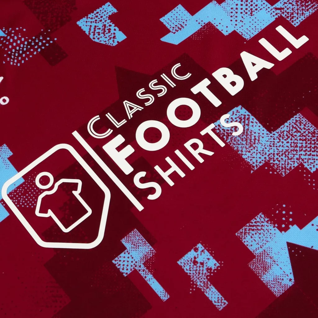
- Visual Synergy: The CFS logo is clean, monochromatic, and prestigious. It doesn’t have the garish colors of a betting site or the clinical look of a bank.
- Authenticity: The sponsor itself validates the shirt’s status as a “future classic.” It tells the buyer, “Even the experts in old shirts think this new shirt is cool.”
- The “Clean” Kit Revolution: For years, fans complained about betting logos ruining beautiful designs. The 22/23 Burnley shirt was a breath of fresh air, showing that a thoughtful sponsor can actually enhance the design rather than distract from it.
Does a winning season make a kit more beautiful?
There is a psychological element to kit design: we love the shirts we win in. The Burnley 2022/23 Home Shirt season was legendary for Burnley. They didn’t just win the Championship; they dismantled it. Under Vincent Kompany, they played a brand of expansive, possession-based football that nobody expected.
The “Kompany Effect”
When fans see the pixelated pattern, they don’t just see a design; they see Nathan Tella’s goals, Josh Brownhill’s leadership, and the trophy lift.
“A great kit gets you noticed, but a great season makes the kit immortal.”
If Burnley had been relegated in this shirt, we might be calling it “the glitchy mess.” Instead, because they dominated the league, the pixelated design is now synonymous with “The Resurrection of the Clarets.” It represents the moment the club moved from the “Sean Dyche era” (pragmatic/traditional) into the “Kompany era” (fluid/digital/modern).
The Verdict: A Blueprint for Future Designs
The Burnley 2022/23 Home Shirt is a triumph because it understands the difference between nostalgia and evolution. It didn’t just ask, “What did we wear in 1991?” It asked, “How would a computer in 2022 interpret 1991?”
Key Takeaways for Kit Enthusiasts:
- Pixelation is the new Retro: It offers a softer, more wearable take on aggressive 90s patterns.
- Sponsorship Matters: A sponsor that aligns with the kit’s “vibe” can turn a sports uniform into a fashion statement.
- Storytelling is King: By linking the kit to a specific title-winning anniversary, the club gave the fans an emotional reason to buy it.
Whether you are a Burnley fan or just a collector of beautiful things, the 22/23 home shirt stands as a reminder that football fashion is at its best when it plays with the boundaries of time. It is a shirt that looks backward to move forward—a true victory for pixel art in the beautiful game.